Ever wonder why some product features are non-negotiable, while others are just nice to have, and a rare few completely blow you away? That’s the core question the Kano Model helps product teams answer.
Developed in the 1980s by Professor Noriaki Kano, this framework analyzes product features through the lens of customer emotion. It helps you understand that not all features are created equal; a study of over 45 Kano model applications found that companies using it boosted customer satisfaction by an average of 18% and cut development costs by 15% by avoiding features customers didn’t value.
Instead of treating every feature request as equal, the Kano Model sorts them into distinct categories: the absolute must-haves, the ones that directly boost satisfaction, and the unexpected surprises that create true delight and loyalty.
What Is the Kano Model and Why Does It Matter
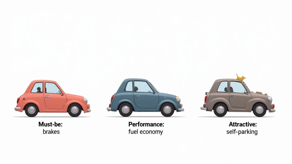
Think about what you expect from a new car. Brakes are a given, right? You don’t get excited about them, but you’d be furious if they were missing. Those are a basic expectation. Then there are things like fuel economy—the better it is, the happier you are. That’s a performance feature.
But what about a car that parks itself? The first time you experience that, it’s a “wow” moment. That’s a delighter. The Kano Model provides a structured way to identify, categorize, and prioritize these different types of features.
This is critical because it prevents product teams from mindlessly adding features. Instead, you can focus on shipping the right things that build loyalty and create a competitive advantage. It’s all about investing your time, money, and effort where it will make the biggest impact on customer satisfaction.
The Origins of Customer Delight
Professor Noriaki Kano developed his model in 1984 after a groundbreaking study involving 900 participants, proving that not all features are equal in the eyes of the customer. His work was a game-changer for product development.
By the 1990s, industry leaders in Japan like Toyota and Sony were already applying his model to great effect. Some reported a jump in customer satisfaction scores of up to 25% simply by prioritizing features according to Kano’s principles.
When you understand the emotional drivers behind your customers’ needs, you can build products they genuinely love. This is a perfect complement to understanding what customers truly value, a topic we explore in our guide on the value proposition canvas .
Beyond a Single Framework
The Kano Model is a powerful tool that blends both qualitative and quantitative insights, but it’s not the only tool in the box. To get a comprehensive view of your users’ needs, it’s worth exploring other essential user research methods as well.
The end goal is always the same: make smart, data-backed decisions that balance delighting your customers with what’s feasible for the business. That’s how you turn great user insights into a successful product.
Exploring the Five Kano Feature Categories
The real magic of the Kano model is how it sorts features into five distinct categories based on what customers actually feel about them. It stops us from treating every feature request as equally important and instead reveals the hidden dynamics behind user satisfaction.
Understanding these categories is the first step toward making smarter product decisions. Each one tells a unique story about what your customers truly value, helping you separate the must-haves from the nice-to-haves and the game-changers.
Must-Be Features (Basic Expectations)
These are the absolute, non-negotiable basics. Customers just assume these features will be part of your product, and they expect them to work perfectly every single time. Having them doesn’t make anyone happy, but not having them? That causes immediate frustration.
Think of them as the price of admission. You don’t get a round of applause for putting a steering wheel in a car, but you’d certainly hear about it if it were missing. In software, this could be a reliable login system or the ability to save your work. A 2022 study on app retention found that 53% of users will abandon an app if it’s buggy or crashes, underscoring the critical importance of these fundamentals.
Performance Features (One-Dimensional)
This category is refreshingly simple: the better you make it, the happier your customers get. It’s a direct, linear relationship. These are the features that users consciously look for and will actively compare when they’re shopping around.
Better performance means a better experience, plain and simple. We’re talking about things like faster processing speeds, more storage space, or longer battery life. For a project management tool, being able to handle a massive, complex project without lagging is a huge performance win. These are often the features that justify a higher price and become the heroes of your marketing campaigns.
The core idea behind Performance features is linear satisfaction. Doubling the speed doesn’t just make the feature twice as good on paper; it often leads to a proportional increase in how happy the customer feels using it.
Attractive Features (Delighters)
These are the unexpected gems—the “wow” moments that make users light up. Nobody asks for them, so not having them causes zero dissatisfaction. But when they’re there, they can create real delight and give you a massive edge over the competition.
These are your game-changers. Remember the first time an analytics tool gave you an AI-powered insight you didn’t even know to look for? Or when a photo editor’s “magic” background removal tool just worked? That’s the feeling. Keep in mind, though, that today’s delighters often become tomorrow’s basic expectations as everyone else catches up.
Pinpointing what will truly delight a user is tricky. It demands a deep understanding of unspoken needs and the technical know-how to bring it to life. This is where defining crystal-clear requirements with a platform like the Context Engineer MCP becomes invaluable. It ensures the AI agents building the feature have a precise blueprint, turning a great idea into a feature that genuinely wows people.
The Other Two Categories
While the first three categories get most of the attention, the Kano model includes two others that are just as important for rounding out your understanding.
- Indifferent Features: Your customers could not care less about these. Whether they exist or not has zero impact on their satisfaction. These features just burn through development time and resources that could be invested somewhere more valuable.
- Reverse Features: These features actively annoy users. The more you add, the less happy people become. Think of an overly complicated interface or an “intelligent” automated pop-up that constantly gets in the way. Identifying and axing these is a quick and easy win for the user experience.
Kano Model Feature Categories Explained
Here’s a quick cheat sheet to help you keep the five categories straight. It breaks down how each one impacts satisfaction and gives a simple example.
| Category | Impact if Present | Impact if Absent | Example Feature |
|---|---|---|---|
| Must-Be | No impact; simply expected. | High dissatisfaction. | A login/password reset function for a user account. |
| Performance | Satisfaction increases as performance improves. | Dissatisfaction increases as performance drops. | Faster file upload speeds in a cloud storage app. |
| Attractive | High satisfaction; creates delight. | No impact; not expected. | AI-suggested email replies in a new email client. |
| Indifferent | No impact on satisfaction. | No impact on satisfaction. | The option to change the color of a settings menu. |
| Reverse | Dissatisfaction increases. | No impact. | Automatic video-play with sound on a news website. |
Understanding this table is key. It’s the foundation for turning customer feedback into a smart, actionable product roadmap that focuses on what truly matters.
Getting Started: How to Run Your First Kano Model Survey
Alright, you understand the Kano categories. Now, how do you actually figure out which of your features fall into which bucket? The answer is data, and you get that data by running a Kano survey.
This isn’t your average feedback form. A Kano survey is designed specifically to get past surface-level opinions and uncover the real emotional impact of a feature. It helps you understand how people truly feel.
The good news is, it’s a lot less complicated than it sounds. It all comes down to a bit of planning and asking the right questions. Let’s walk through how to do it, step-by-step.
Step 1: Pick Your Features and Your People
First things first: decide what you want to ask about. You can’t test every single idea at once—people will get tired and give you sloppy answers. Stick to a manageable list of 5 to 10 features per survey. A good rule of thumb is to pick features that are strategically important, heavily debated by your team, or require a big investment of time and money.
Next, figure out who you’re asking. The quality of your insights depends entirely on your audience. Make sure you’re surveying actual users or a group that accurately represents your target market. If you ask the wrong people, you’ll get misleading data that could send your development efforts in the completely wrong direction.
Step 2: Write Your Paired Questions
Here’s the secret sauce of the Kano survey: the paired questions. For every single feature you’re testing, you’ll ask two questions back-to-back.
One question asks how the user would feel if they had the feature (the functional version). The other asks how they’d feel if they didn’t have it (the dysfunctional version).
You’ll frame their potential answers using a simple five-point scale that captures their gut reaction:
- I like it.
- I expect it.
- I am neutral.
- I can live with it.
- I dislike it.
This two-sided approach is what lets you accurately categorize each feature. For instance, if someone says “I expect it” when they have the feature but “I dislike it” when they don’t, that’s a massive clue you’re looking at a Must-Be feature.
Step 3: Put Your Survey Questions Together
Let’s make this real. Imagine you’re thinking about adding an “AI-powered summary” to your project management software. Here’s what your question pair would look like:
Functional Question “If your project management tool automatically generated a weekly AI-powered summary of project progress, how would you feel?”
- I like it
- I expect it
- I am neutral
- I can live with it
- I dislike it
Dysfunctional Question “If your project management tool did NOT automatically generate a weekly AI-powered summary, how would you feel?”
- I like it
- I expect it
- I am neutral
- I can live with it
- I dislike it
You’ll just repeat this pattern for every feature on your list. If you need more ideas on how to phrase questions to get great feedback, our guide on client feedback form templates has some useful tips for capturing what users are thinking.
Key Takeaway: How you word these questions is everything. Be crystal clear and focus on a single benefit for each feature. Any confusion or ambiguity will muddy your results and make the analysis much harder. Getting the questions right is the foundation for everything that comes next.
Turning Survey Data into Actionable Insights
Alright, you’ve run your Kano survey, and now you have a pile of raw responses. This is where the magic happens. We need to take all that feedback and turn it into something we can actually use to build a better product. The first step is translating those individual answers into clear feature categories.
This is done with a standard evaluation table. You’ll take each person’s paired answers—how they feel when a feature is there versus when it’s not—and map them to one of the Kano categories: Must-be, Performance, Attractive, Indifferent, or Reverse. This is how you turn fuzzy feelings into hard data.
From Numbers to Categories
For every feature you tested, tally up how many users put it into each category. The one with the most votes wins, becoming that feature’s main classification. For example, if 70% of your users categorize an “AI-powered summary” as Attractive, then that’s what it is.
This simple majority vote gives you a quick snapshot, but for the really smart decisions, you need to go a bit deeper and visualize the results.
A concept map like this can be a great way to get your thoughts in order before you dive into the nitty-gritty of analysis.
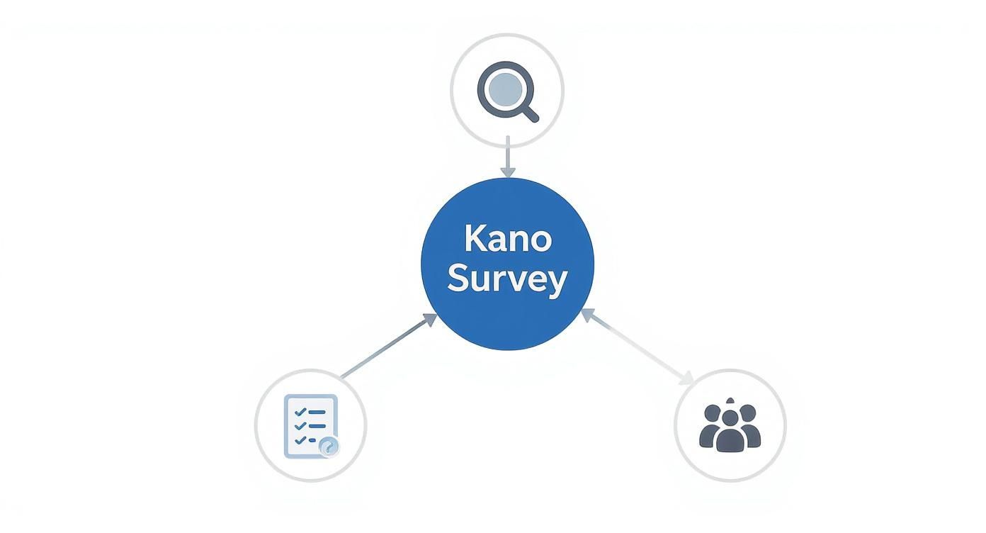
As you can see, a good Kano survey really comes down to the connection between the features you pick, the questions you ask, and the people you survey. Get those right, and you’re golden.
Plotting Your Kano Graph
The best way to see the big picture is by plotting your features on a Kano graph. It’s a simple chart with two axes:
- Horizontal Axis (X-axis): This shows how well a feature is implemented, from not having it at all to having it fully built out.
- Vertical Axis (Y-axis): This tracks customer satisfaction, from totally frustrated to absolutely delighted.
When you plot where each feature lands based on what your users told you, you get an instant visual map of your product strategy. You can see your must-haves, your performance-based differentiators, and your potential game-changers all in one place.
And this isn’t just theory; it works. A meta-analysis of 45 studies on the Kano Model found that companies using it boosted customer satisfaction by an average of 18%. They also cut development costs by up to 15% by avoiding work on features customers just didn’t care about. If you’re interested, you can explore the full findings to see how it drives real efficiency.
Key Insight: The Kano graph isn’t just a pretty chart; it’s a decision-making machine. It translates messy human emotions into a simple visual that everyone from engineers to executives can understand, making it much easier to agree on what to build next.
Ultimately, this whole process is about creating clarity. Once your analysis is done, you have a solid, data-backed foundation for your product roadmap. This ensures that every feature you decide to build is rooted in what customers actually value. From here, you can take your visual graph and move to a well-defined feature scope, which is where precise tools like the Context Engineer MCP can help bridge the gap between insight and execution.
Integrating Kano Insights into Your Product Roadmap
You’ve done the hard work of turning survey responses into a clear, visual graph. So, what’s next? This is where the magic happens—translating those powerful insights into real-world action. Your Kano analysis becomes the compass for your product roadmap, guiding strategic decisions and making sure you’re building what customers actually care about. It’s all about moving from data to a concrete plan.
A smart roadmap isn’t just a race to build the most exciting features. It’s a strategic allocation of resources across all the Kano categories. The goal is a product that’s stable, competitive, and maybe even a little bit magical. You need a plan that nails the basics while also leaving room for thoughtful innovation.
Balancing Your Feature Portfolio
Think of your product roadmap like a well-balanced investment portfolio. Your Kano analysis is the financial advisor telling you exactly where to put your resources for the best returns—in this case, customer satisfaction.
-
Secure the Foundation with Must-Be Features: These are priority number one, no question. If any Must-Be feature is buggy or missing, you’re actively frustrating your customers. Your roadmap must set aside resources to get these implemented and polished before you do anything else. A slip-up here can undermine all your other great work.
-
Compete with Performance Features: This is how you win in the market day-to-day. Your Kano graph points to the Performance features users value most. Your roadmap should include a steady stream of improvements here, helping you stay ahead of (or at least on par with) the competition.
-
Innovate with Attractive Features: These are your “wow” moments. They build buzz, foster loyalty, and can set the tone for your product’s future. While they might not be the most urgent, your roadmap should always have space for one or two high-impact Attractive features. These are what make people fall in love with your product.
Prioritizing with Other Frameworks
The insights from your Kano analysis don’t live on an island. They’re a powerful input that makes other prioritization frameworks much more effective by adding a layer of real customer-centric data.
Frameworks like RICE (Reach, Impact, Confidence, Effort) or MoSCoW (Must have, Should have, Could have, Won’t have) suddenly become sharper when you feed them Kano data. For instance, a feature you’ve identified as Attractive would naturally score high on “Impact” in a RICE analysis. This combination ensures your priorities are grounded in both emotional insight from users and solid business logic. It’s a key part of building a strong plan, much like the process of hypothesis-driven development , where you validate ideas before going all-in.
From Insight to Precise Execution
Okay, so you know what to build. The final hurdle is making sure the engineering team understands the nuance behind each feature. A requirement for an Attractive feature is worlds apart from a Must-Be one—the goal is to create delight, not just check a box.
This is where clarity is everything. You need to translate those nuanced user needs into crystal-clear technical specs. For teams leveraging AI for development, this precision is even more critical. Platforms like the Context Engineer MCP ensure that the AI agents responsible for coding have the exact context needed to deliver the intended user experience, preventing the misinterpretation that can turn a potential home run into a dud.
For a deeper dive into creating and managing your product plan, check out these product roadmap best practices for more great advice.
Kano Model FAQ: Your Questions Answered
Even after you’ve got the basics down, you’ll probably have some practical questions once you start putting the Kano model into action. This section is here to clear up those common sticking points and help you avoid a few classic mistakes along the way.
Think of it as a quick reference guide to keep in your back pocket.
How Often Should I Run a Kano Survey?
A Kano analysis isn’t a one-and-done deal. Customer expectations are always on the move—what delights someone today might just be a basic expectation tomorrow. For a mature product, a good rule of thumb is to run a survey about annually.
But you’ll want to do it more often if you find yourself:
- Stepping into a brand new market where you don’t know the customer base.
- Getting ready for a major product overhaul or redesign.
- Seeing competitors roll out new features that change the game.
Can I Use the Kano Model for Services, Not Just Products?
Absolutely. The framework is surprisingly flexible and works just as well for services as it does for software or physical goods. In a service world, a “feature” can be anything from how you handle customer support to the way your billing works.
For example, offering “24/7 chat support” could be a Performance feature—the faster the response, the happier the customer. But something like “a proactive discount automatically applied after a service outage” would be a fantastic Attractive feature that builds serious goodwill. The core idea of mapping out customer satisfaction is exactly the same.
What’s the Biggest Mistake People Make With This?
The most common trap is treating the results like they’re set in stone. Teams will do one analysis and then assume those insights are good forever, but as we said, expectations change. Another huge error is surveying the wrong people. If you ask brand-new users about features designed for seasoned power users, your data will be completely skewed.
It’s so important to survey your actual target audience and make sure your functional and dysfunctional questions are crystal clear. Bad data going in means a bad product strategy coming out.
How Many Features Can I Test in a Single Survey?
To keep people from getting tired and just clicking random buttons, try to stick to 5 to 10 features per survey. Any more than that, and you risk survey fatigue, where participants rush through their answers just to get it over with. That’s a surefire way to get unreliable results.
If you have a long list of potential features, don’t cram them all into one massive survey. A better approach is to split them up into a few shorter surveys and send them to different segments of your user base. You’ll still get all the feedback you need without burning out your participants.
Once you have these rich customer insights, the final challenge is turning them into a clear plan for your engineers. This is where Context Engineering comes in, acting as the bridge between your Kano analysis and the actual work. The Context Engineer MCP helps ensure that whether you’re building a must-have or a delighter, your AI development agent gets the precise context it needs to build it right the first time.