Tired of deploying a fix only to have the same bug resurface two sprints later? You’re not alone. In fact, studies show that developers spend nearly 50% of their time debugging, a clear sign that surface-level fixes aren’t working. This is where fishbone diagram analysis becomes essential. It’s a visual, structured brainstorming technique that guides your team past the symptoms to uncover the real root causes of persistent problems.
Think of it as a roadmap for your team’s collective brainpower, helping you organize complex technical thoughts and pinpoint solutions that actually stick.
Why Your Team Needs Fishbone Diagram Analysis
If your engineering team feels like it’s constantly putting out fires—patching urgent issues without ever figuring out why they keep cropping up—you’re caught in a cycle of reactive problem-solving. A staggering 85% of executives admit their organizations struggle with effective problem diagnosis, leading to a massive drain on resources. A structured approach like a fishbone analysis can completely change that dynamic.
It forces your team to slow down and look beyond the obvious. Instead of just applying a quick fix to a bug, you start investigating every possible factor. Is it the code? The deployment pipeline? The third-party services? Maybe it’s the underlying infrastructure. This kind of deep dive is what stops the same problems from derailing future sprints.
Immediate Benefits of Fishbone Analysis for Tech Teams
Discover the direct advantages your engineering team can gain by adopting fishbone diagrams for problem-solving.
| Benefit | Impact on Technical Projects |
|---|---|
| Deeper Insights | Moves beyond surface-level fixes to uncover systemic issues in code, processes, or tools. |
| Improved Collaboration | Provides a shared visual framework that encourages input from all team members, not just seniors. |
| Reduced Rework | By solving the root cause, you prevent the same bug or issue from recurring in the future. |
| Better Documentation | The diagram itself serves as a clear record of the problem-solving process for future reference. |
Ultimately, adopting this method helps teams build more stable and scalable systems by shifting from a reactive mindset to a proactive one.
The Proven Value of Structured Analysis
This isn’t some new, untested fad. The fishbone diagram—also called an Ishikawa diagram—was developed back in the 1940s by Kaoru Ishikawa and really took off in the 1960s at the Kawasaki shipyards. It’s now recognized as one of the seven foundational tools of quality control, with over 50 years of proven value across just about every industry you can think of.
By getting to the heart of what’s really going on, this analysis is a fantastic way to improve operational efficiency .
From Chaos to Clarity
Let’s be honest: brainstorming sessions on complex technical issues can devolve into chaos fast. Ideas fly everywhere, people talk over each other, and you end the meeting with no clear path forward.
The fishbone diagram brings order to that chaos. It provides a visual structure that channels the team’s thinking into logical categories, making sure every angle is covered systematically. This structure is the backbone of any good root cause analysis .
By visually mapping out potential causes, teams can see connections and dependencies they might otherwise miss. It turns a messy discussion into a focused, evidence-based investigation.
The real magic happens when you connect these insights back to your daily work. For instance, a Model Context Protocol (MCP) server can capture the findings from your analysis and link them directly to the relevant parts of your codebase or infrastructure-as-code. This ensures the “why” behind a fix is never lost—a crucial piece of context that prevents your team from making the same mistakes twice.
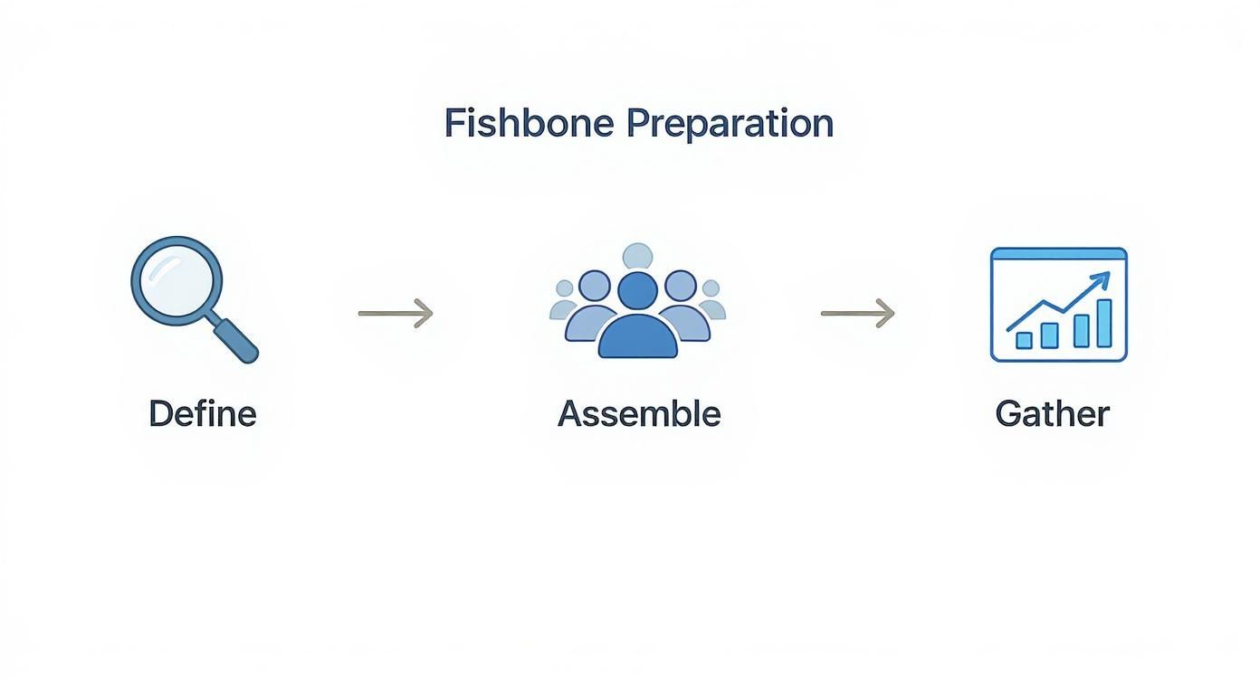
Setting the Stage for a Successful Analysis
A good fishbone analysis starts long before you even touch a whiteboard. The most important thing you can do upfront is to nail down a crystal-clear, data-driven problem statement. Vague goals like “improve app performance” are a surefire way to end up in a rambling, unproductive meeting.
You have to get specific. Don’t just say, “the user dashboard is slow.” Instead, frame it like this: “The p95 API response time for the user dashboard has increased from 200ms to 800ms in the last 7 days, impacting 15% of users.” A statement like that gives everyone a concrete, measurable target. It ensures you’re all solving the exact same problem.
Assemble Your Cross-Functional Team
Once your problem is clearly defined, it’s time to get the right people in the room. Root cause analysis is a team sport, not a solo mission. You need different perspectives because what looks like a database issue to a backend engineer might be a front-end rendering bottleneck to someone else.
Your ideal crew will have a mix of roles to get a complete picture of the system.
-
Backend and Frontend Developers: They’re closest to the code and can speak to the implementation details.
-
Site Reliability Engineers (SREs) or DevOps folks: These are the people who own the infrastructure and deployment pipelines.
-
QA Engineers: They bring a wealth of knowledge about testing, bugs, and what users are actually experiencing.
-
A Product Owner or Manager: They provide the all-important user impact and business context.
This mix of expertise is your biggest advantage. Research from McKinsey shows that diverse teams are 35% more likely to have financial returns above their respective national industry medians, a testament to the power of varied perspectives in decision-making. It helps you avoid groupthink and spot those tricky, hidden connections between different parts of your stack.
Arm Your Team with Data
Last but not least, make sure everyone shows up with evidence, not just opinions. The analysis can go off the rails fast if it’s based on assumptions and gut feelings. Before the meeting, the facilitator should pull together all the relevant data and share it with the team.
You want to shift the conversation from “I think the problem might be…” to “The logs show a spike in latency right after this deployment.” That’s the difference between a productive session and a guessing game.
Make sure to have performance monitoring dashboards from tools like Datadog or New Relic , recent error logs, customer support tickets, and a history of recent code changes. This prep work ensures your brainstorming is grounded in reality, which leads to a far more accurate and useful fishbone diagram.
Putting the Fishbone Diagram to Work: A Step-by-Step Guide
Alright, you’ve defined the problem and gathered the right people. Now it’s time to bring the fishbone diagram to life. This is where your prep work starts paying off and turns into real, actionable insights.
Grab a whiteboard (physical or virtual) and draw the “head” of the fish on the right side. Inside it, write your crystal-clear problem statement. Then, draw a long horizontal line shooting out to the left—that’s the spine.
Next, you’ll sketch out the main “bones” branching off the spine. These are your cause categories. Now, a word of caution: many guides will tell you to use the traditional “6 Ms” (Man, Machine, Method, etc.). Honestly, for most software or infrastructure problems, those categories feel awkward and forced. They were designed for a factory floor, not a modern tech stack.
You’ll get much better results by tailoring your categories to the world your team actually lives in. A little upfront thought here goes a long way. And remember, a well-run session is key; check out these strategies for running effective meetings if you need a refresher on keeping things on track.
Choosing Categories That Actually Make Sense for Tech Teams
Don’t try to cram a software bug into a manufacturing box. It just doesn’t work. Instead, use categories that resonate with developers, SREs, and DevOps engineers.
Here are a few a good starting points that we’ve found work well for technical incidents:
-
Code: This is for anything related to application logic. Think algorithms, legacy code that someone is afraid to touch, or a recently merged pull request.
-
Infrastructure: Your home for problems with servers, cloud services (like AWS or Azure), networking, or container orchestration like Kubernetes.
-
Data: This bone catches anything from the database—slow queries, unindexed columns, data integrity issues, or problems with your caching layers.
-
Dependencies: Perfect for issues coming from outside your direct control, like a third-party API that’s timing out or another internal microservice that isn’t responding correctly.
-
Process: This category is about how your team works. Think deployment procedures, gaps in the testing cycle, on-call handoff confusion, or a flawed code review process.
The goal is to set the stage for a productive session built on a solid foundation: a clear problem, the right people in the room, and all the necessary data gathered beforehand.
To make this distinction clearer, here’s how the old-school approach compares to a more modern, tech-focused one.
Standard vs. Tech-Specific Cause Categories
| Traditional Category (Manufacturing) | Modern Tech-Equivalent Category |
|---|---|
| Manpower (People) | Process (Team workflows, communication, skills) |
| Machine (Equipment) | Infrastructure (Servers, cloud, network) |
| Method (Process) | Code (Logic, architecture, libraries) |
| Material (Raw Materials) | Data (Databases, caches, integrity) |
| Measurement (Inspection) | Tooling (Monitoring, CI/CD, testing tools) |
| Mother Nature (Environment) | Dependencies (APIs, third-party services) |
Using categories your team instantly understands removes friction and gets the ideas flowing faster.
Time to Brainstorm: Digging for the Root Cause
With your categories set, it’s time to brainstorm potential causes for each one. As the facilitator, your job is to get everyone talking, not just the senior engineer who always has an opinion. At this stage, you’re looking for quantity over quality. Get all the ideas out on the board.
When someone suggests a potential cause, your work has just begun. For instance, if someone under the “Data” category says, “The database query was slow,” that’s a great start, but it’s a symptom, not a root cause. Don’t let the conversation stop there.
The real power of a fishbone isn’t just listing problems; it’s uncovering the hidden chain of events that led to the failure. You have to push past the first, most obvious answer.
This is where the 5 Whys method becomes your best friend. It’s a simple but incredibly effective technique for peeling back the layers of an issue. Why was the query slow? “Because it was doing a full table scan.” Why? “Because it was missing an index.” Why was the index missing? “Because it wasn’t part of the code review checklist for database changes.” Now that’s something you can fix.
Each “why” creates a new, smaller branch on your diagram, letting you go as deep as you need to find the real source of the trouble. This process naturally keeps the session focused and prevents it from turning into a venting session. What you’re left with is a diagram packed with potential root causes, all teed up for prioritization and action.
Turning Your Diagram into Actionable Fixes
A finished fishbone diagram, filled with potential causes, feels like a big win. But it’s really just the starting point. The real payoff comes when you turn those ideas into actual, concrete fixes that solve the problem for good.
This is often where teams get stuck. Staring at a diagram packed with possibilities can be overwhelming. The trick is to systematically filter the noise and zero in on the causes that will give you the most bang for your buck.
Prioritizing Potential Causes
Once the brainstorming wraps up, it’s time to get focused. Not every potential cause carries the same weight; some are minor annoyances, while others are the real troublemakers. A couple of simple techniques work wonders here:
-
Dot Voting: This one’s a classic for a reason. Give everyone on the team a few votes (say, 3-5 dots) to place next to the causes they think are the most significant. It’s a quick, democratic way to see where the team’s collective gut instinct is pointing.
-
Impact/Effort Matrix: For a more strategic view, sketch out a simple four-quadrant grid. Label one axis “Impact” and the other “Effort.” Talk through each potential cause as a team and place it on the matrix. This immediately separates your quick wins (high impact, low effort) from the bigger, more involved projects (high impact, high effort).
Taking the time to prioritize prevents your team from spinning its wheels on low-impact tasks and channels that energy into fixes that truly matter.
From Vague Ideas to Testable Hypotheses
With your top-priority causes identified, you need to turn them from fuzzy concepts into something you can actually test. A task like “fix the database” is a dead end—it’s too vague to be actionable.
You have to reframe it as a specific, measurable hypothesis. For instance, “fix the database” could become: “We believe that adding a composite index to the users and orders tables will cut query latency by over 50%.” Now that’s a clear statement with a built-in success metric. If you want to dive deeper into structuring goals like this, check out our guide on the SMART goals framework
.
This simple shift changes the game from a theoretical discussion to a practical experiment with clear pass/fail criteria.
Embedding Learnings into Your Workflow
This is the crucial step that prevents the same problems from cropping up again. The “why” behind a fix is just as important as the fix itself. Imagine an engineer six months down the line stumbling upon that new database index—will they have any clue why it was added?
By embedding the context from your analysis directly into your engineering tools, you create a living history. This is the core principle of Context Engineering. By using a Model Context Protocol (MCP) server, you can link all that rich information—the diagram itself, meeting notes, relevant data—directly to the specific code, infrastructure, or configuration that was changed.
This ensures that valuable knowledge doesn’t get buried in forgotten documents or fade from memory. Instead, you create a permanent, easily accessible record explaining not just what was done, but why it was the right call, saving future teams from having to solve the same problem all over again.
Common Mistakes in Fishbone Analysis
Even with a great framework, a fishbone analysis session can quickly go off the rails. I’ve seen it happen many times. One of the most common traps is teams getting stuck on symptoms instead of digging for the actual root causes.
For instance, someone might jot down “high CPU usage” under the ‘Code’ category. But high CPU usage isn’t the cause; it’s the result. The real problem is likely hiding deeper—maybe an inefficient algorithm, a database query that never ends, or a sneaky memory leak. You have to keep asking “Why?” until you can’t anymore.
Another classic pitfall is letting the conversation be hijacked by the loudest or most senior person in the room. This completely defeats the purpose of bringing a diverse group together and you end up with a bad case of groupthink. A good facilitator is your best defense here, making sure to actively pull insights from everyone, especially the quieter folks who are often observing things no one else is.
Keeping the Analysis Focused
It’s also incredibly easy for the diagram to become a sprawling, unreadable mess. While you want to capture every potential idea, the end goal is clarity, not chaos. If one of your “bones” gets too crowded, it’s a huge red flag. It could mean that category needs to be broken down further, or, more likely, the team is wandering off track.
A few simple tricks can help keep the session on point:
-
Anchor to the problem: Keep pointing everyone back to the problem statement you all agreed on at the start.
-
Be brief: Use short, punchy phrases for causes, not full-blown sentences. Think “slow API response,” not “The external user authentication API is taking too long to return a token.”
-
Use a “parking lot”: Great ideas that are off-topic will inevitably pop up. Don’t shut them down; just jot them on a separate whiteboard or doc to tackle later.
This kind of discipline is what turns a fishbone diagram from a messy meeting artifact into a genuinely useful tool.
An idea is just an idea until it’s backed by evidence. The final, and arguably most critical, mistake is failing to validate your top hypotheses with actual data.
Validating Causes and Building Team Expertise
Don’t let your hard work go to waste by skipping the verification step. Your diagram will give you a handful of probable root causes, but they’re just educated guesses until you prove them. Before you assign a single engineering ticket, use whatever you have—application logs, performance metrics, user session recordings, or even a quick proof-of-concept—to confirm or debunk your theories.
Ultimately, the quality of your analysis comes down to the people in the room. It’s no surprise that research shows the diagram’s effectiveness is tied directly to the knowledge and training of the team doing the investigation. As this NHS resource on cause and effect diagrams points out, the best insights come from experienced teams who know their systems inside and out.
Steering clear of these common blunders will help ensure your analysis is not just a thorough exercise, but an accurate one that leads to fixes that actually work.
Common Questions About Fishbone Diagrams
Here are some quick answers to the questions that always seem to pop up when teams first start using fishbone analysis. Getting these straight can save you from a lot of head-scratching down the road.
How Is a Fishbone Diagram Different from the 5 Whys?
It’s a great question, and the simple answer is that they work best together. Think of them as a tag team for root cause analysis.
The fishbone diagram is your brainstorming powerhouse. It’s built to help you explore and visualize a wide range of potential causes across multiple categories all at once. It gives you that 10,000-foot view of everything that might be going wrong.
The 5 Whys technique, on the other hand, is for deep diving. Once you’ve identified a promising cause on your fishbone diagram—say, “inconsistent test data”—you use the 5 Whys to drill down on that one specific branch. It’s a linear, focused tool for peeling back layers until you hit something solid.
Can We Use This for Process Improvement, Not Just Bugs?
Absolutely. A fishbone analysis is just as powerful for untangling process snags as it is for squashing technical bugs. The core idea is the same; you just swap out the problem statement.
Instead of focusing on an effect like “API Timeout,” you might target something like, “New developer onboarding takes over four weeks.”
Your categories would naturally shift to match the problem. You might end up with bones like:
-
Training: Are the learning materials clear? Are they even available when needed?
-
Documentation: Is it up-to-date? Can anyone actually find it?
-
Tooling: How complex is the local setup? Are there long waits for access permissions?
-
Mentorship: Is the buddy system structured and effective, or is it just an afterthought?
This way, you get a clear visual map of all the friction points in a workflow, which makes it much easier to see where you can make real improvements.
What Are the Best Digital Tools for Remote Sessions?
When your team is spread out, a good digital whiteboard is non-negotiable. Just trying to manage this over a standard video call usually ends in chaos and missed ideas.
Tools like Miro , Mural , and Lucidspark are my go-to recommendations. They all have ready-made fishbone templates and fantastic real-time collaboration features. Everyone can jump in and add their thoughts on digital sticky notes at the same time, which keeps the energy high and ensures you hear from everyone, not just the loudest person in the virtual room.
How Do You Know When You’re Actually Done?
This is a critical one. You’re not finished when the diagram looks pretty and full.
A fishbone analysis is truly finished not when the diagram is complete, but when you have a prioritized list of testable hypotheses ready for action.
The diagram is just a tool, an artifact of your collective thinking. The real finish line is crossed when you implement a change based on one of your top hypotheses, and the original problem goes away for good. If it doesn’t come back, you’ve found a genuine root cause. The ultimate goal is always a verified, permanent fix—not just a nice-looking chart.
Ready to turn your root cause analysis into a permanent, accessible knowledge base? At Context Engineering, we help you connect the why behind your fixes directly to your codebase. Learn how our MCP server can prevent your team from solving the same problem twice. Discover more at https://contextengineering.ai .